Stay UP TO DATE
with what Honeycomb has BEEN UP TO.

Cabinet Color Crush: My Favorite Hues That Never Miss
Wanna get the scoop on Designer paint color choices for cabinetry?! Here are our 10 favorite non-white paint colors for cabinetry!
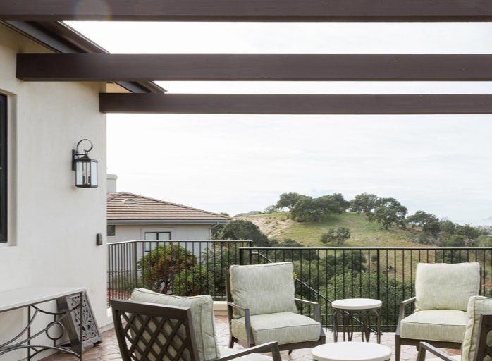
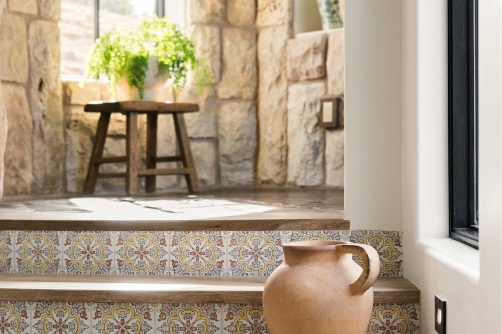
How to Create a Seamless Indoor-Outdoor Living Experience
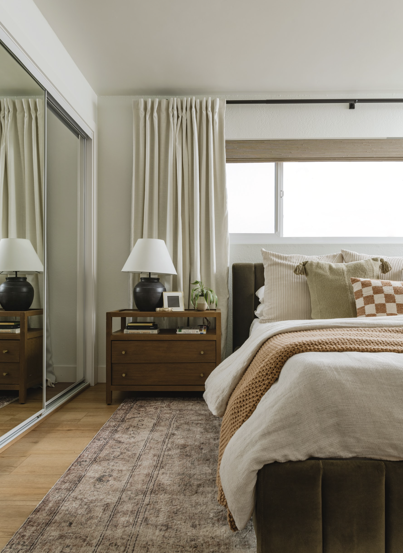
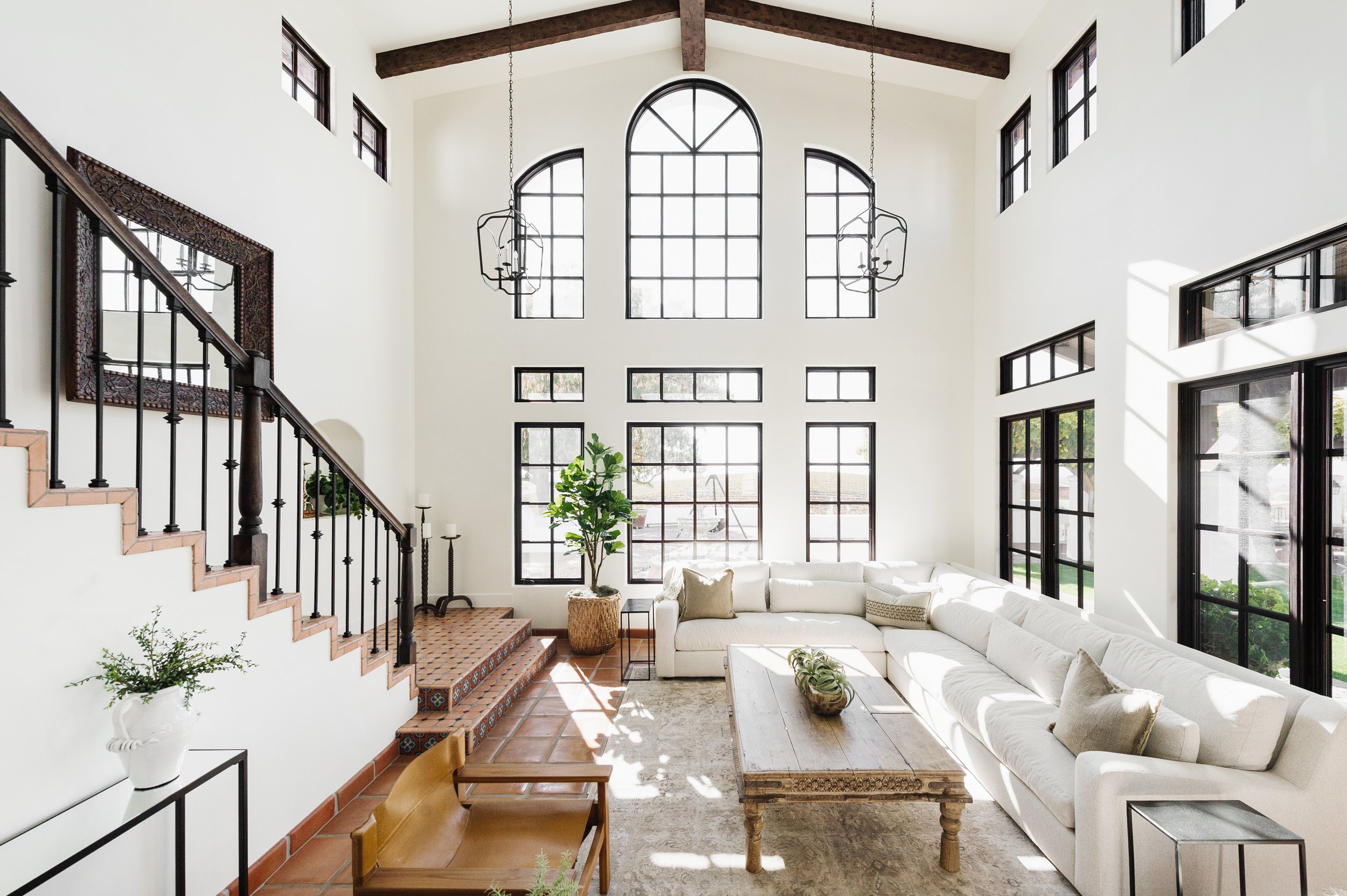
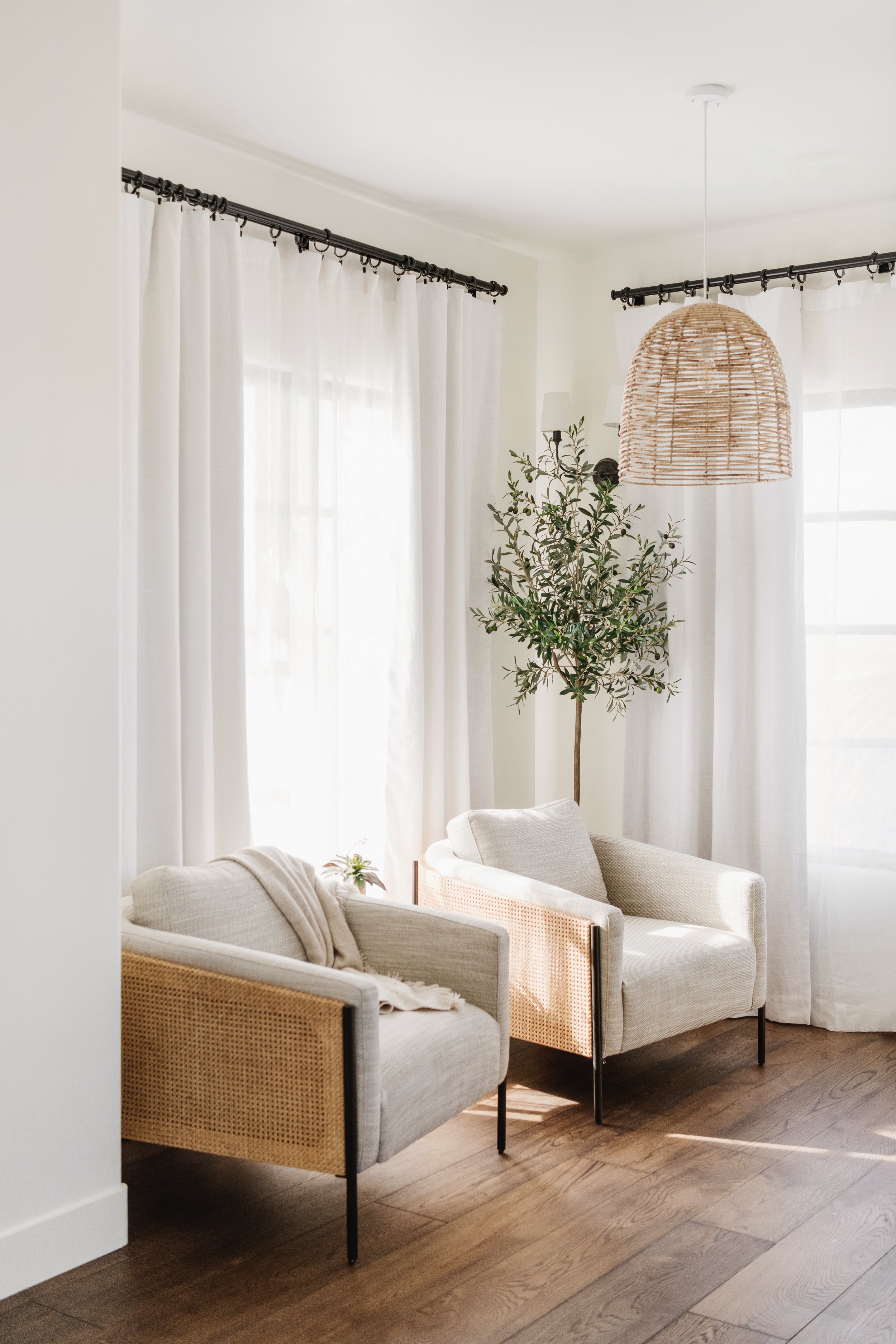
At Honeycomb Home Design, located on the beautiful Central Coast of California, we believe that the best homes offer a seamless transition between indoor and outdoor spaces.
Top Design Tips for Crafting Luxury Home Offices
Welcome to Honeycomb Home Design, your go-to experts in creating stunning luxury interiors on the Central Coast of California. As remote work becomes increasingly popular, a well-designed home office is no longer just a necessity—it’s a reflection of your style and success.
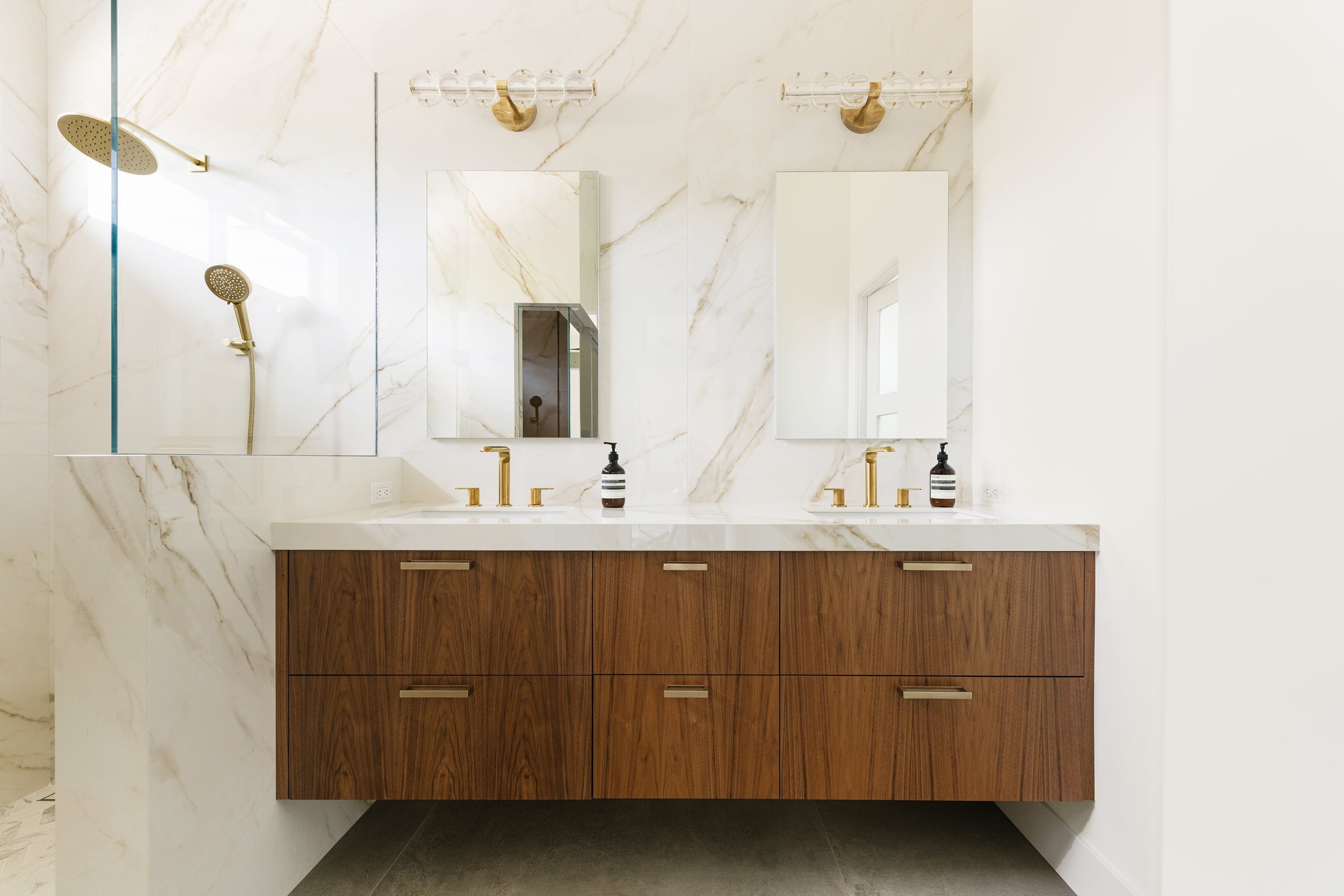
The Art of Selecting Luxury Finishes for High-End Homes
Welcome to Honeycomb Home Design, where we specialize in crafting exquisite interiors that reflect the pinnacle of luxury and sophistication. Based on the Central Coast of California, our team is dedicated to transforming high-end homes with the finest luxury finishes available.
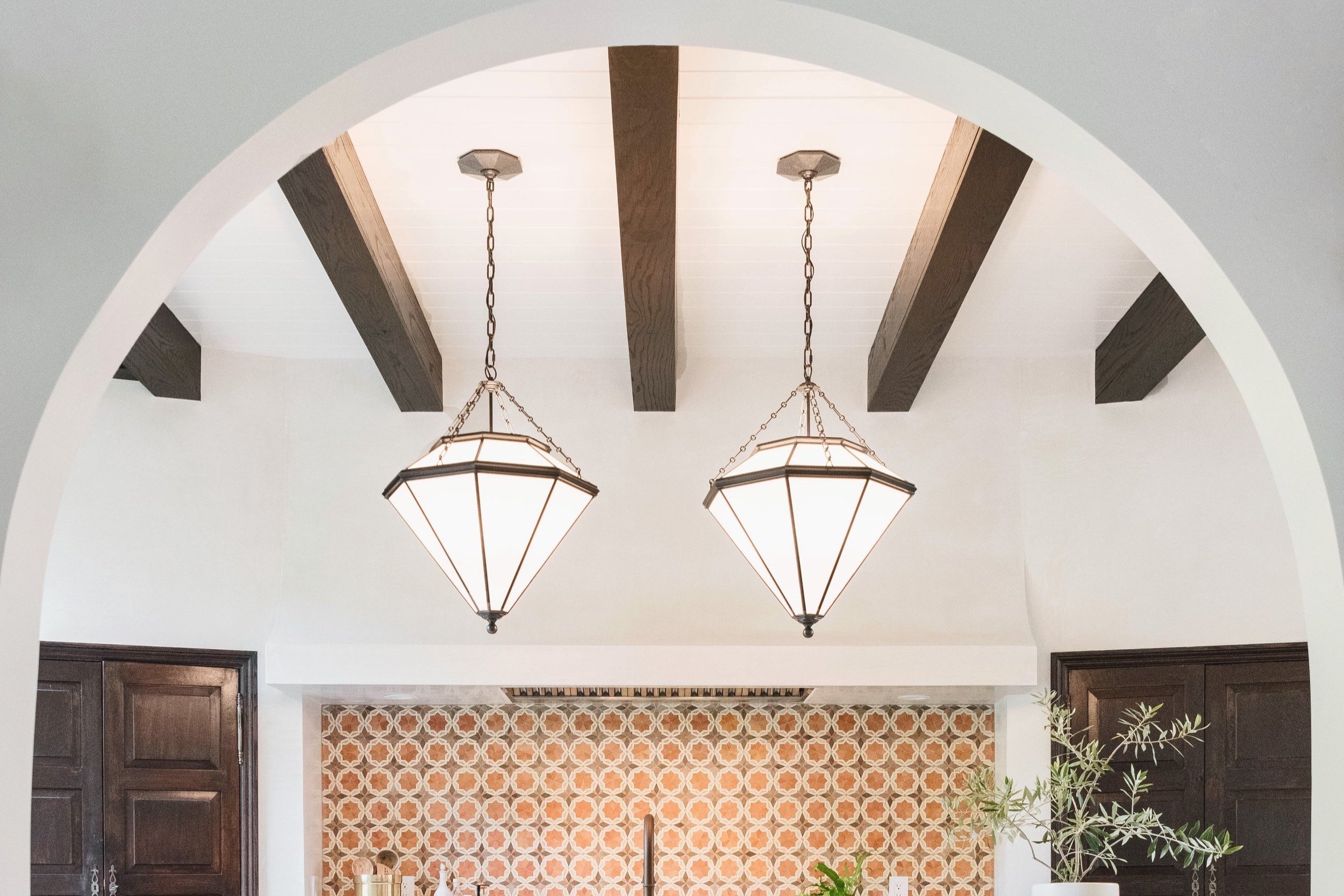
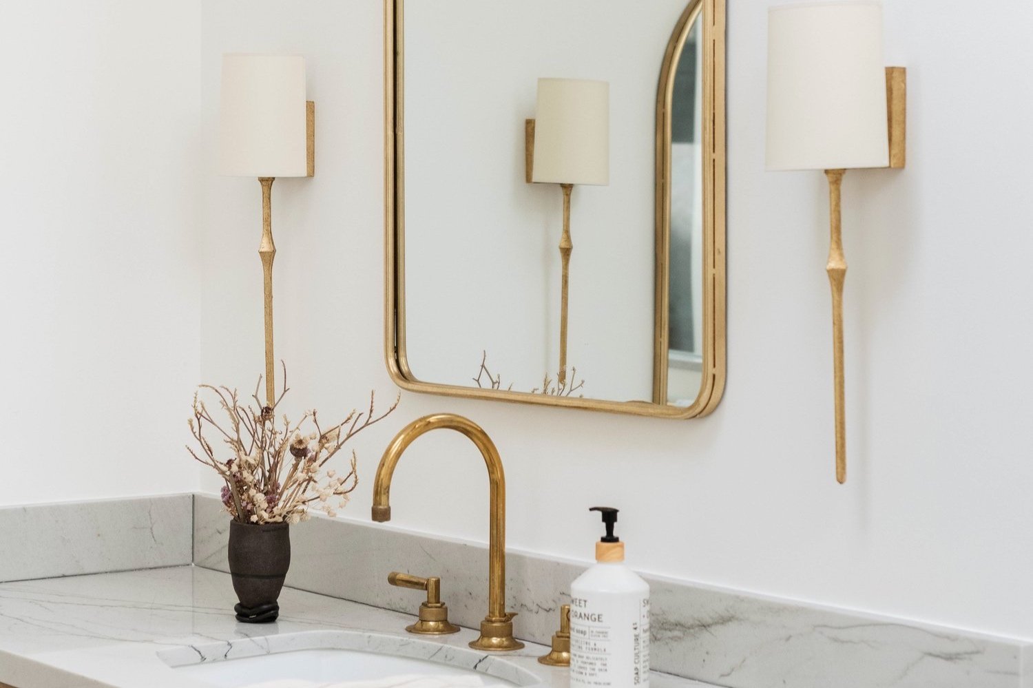
Innovative Lighting Solutions for Luxury Interiors
Welcome to Honeycomb Home Design, where we’re redefining luxury interiors with innovative lighting solutions that transform spaces into stunning works of art. Based on the Central Coast of California, we specialize in creating sophisticated, timeless designs that elevate your home’s ambiance.
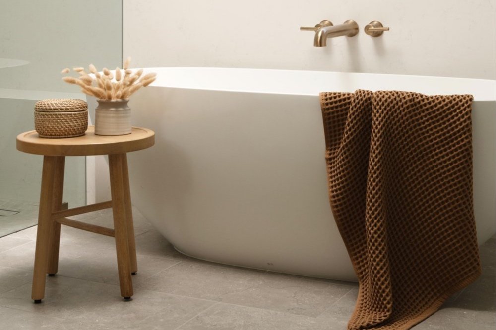
Transforming Luxury Bathrooms: Trends and Ideas for 2024
At Honeycomb Home Design, we believe that a luxury bathroom isn't just a space; it's an experience. Nestled in the stunning Central Coast of California, we specialize in creating exquisite, timeless interiors that reflect the true essence of high-end design.
How to Incorporate Sustainable Design in Luxury Homes
Sustainable design is revolutionizing the world of luxury homes, blending eco-consciousness with high-end elegance. At Honeycomb Home Design, we believe that luxury can coexist with sustainability, creating spaces that are not only stunning but also kind to the environment.
Creating Personalized Luxury: Custom Features for High-End Homes with Honey Cabinetry
In the realm of luxury interior design, personalization and attention to detail are paramount. At Honeycomb Home Design, we elevate the experience of high-end living through our exclusive Honey Cabinetry, crafting custom features that transform spaces into bespoke havens.

Luxury Interior Design: How to Blend Modern and Traditional Styles
When it comes to designing a luxury home, finding the perfect balance between modern and traditional styles can create a sophisticated and timeless space. At Honeycomb Home Design, we specialize in blending these two distinct design aesthetics to craft interiors that are both elegant and inviting.
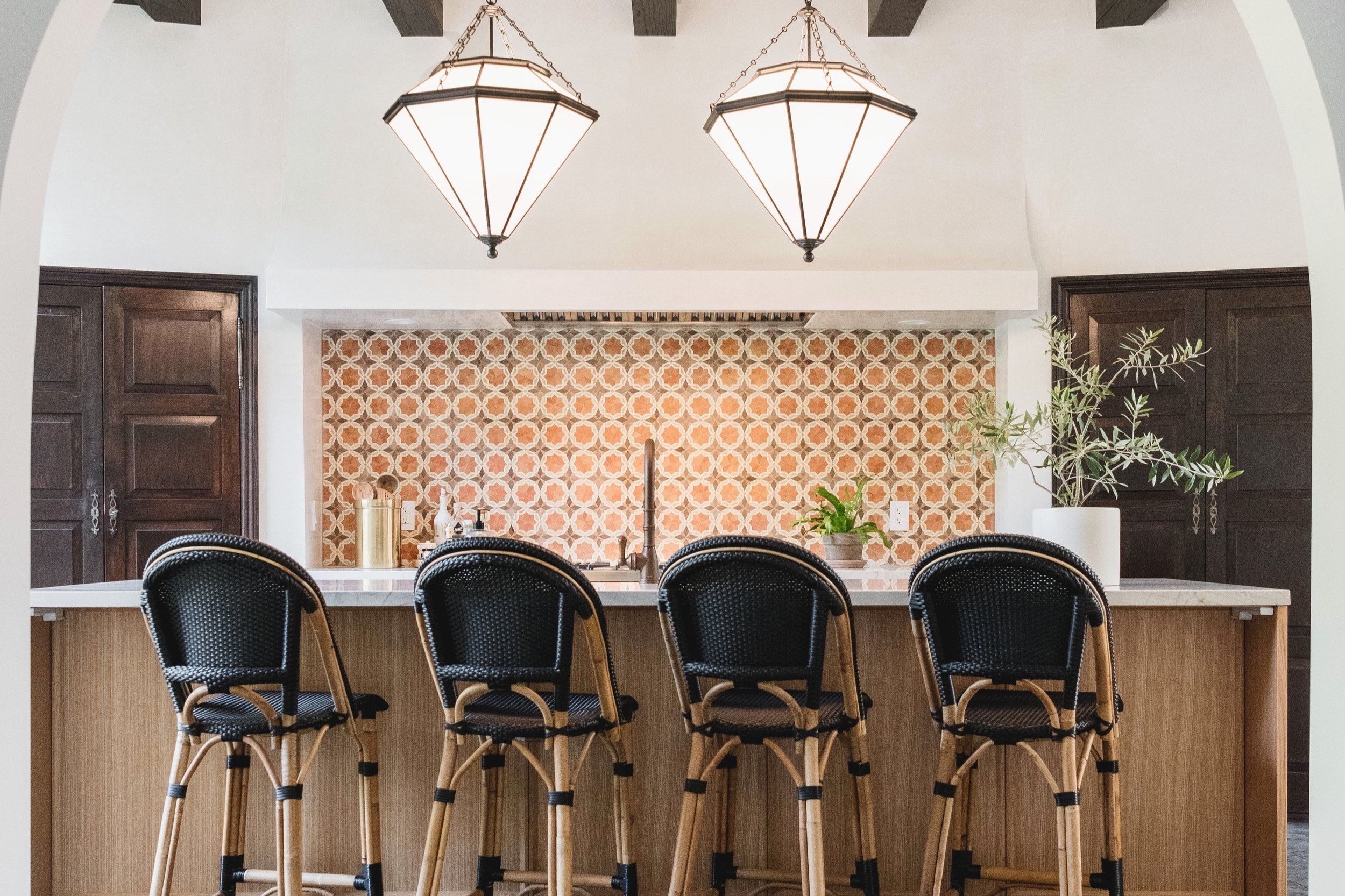
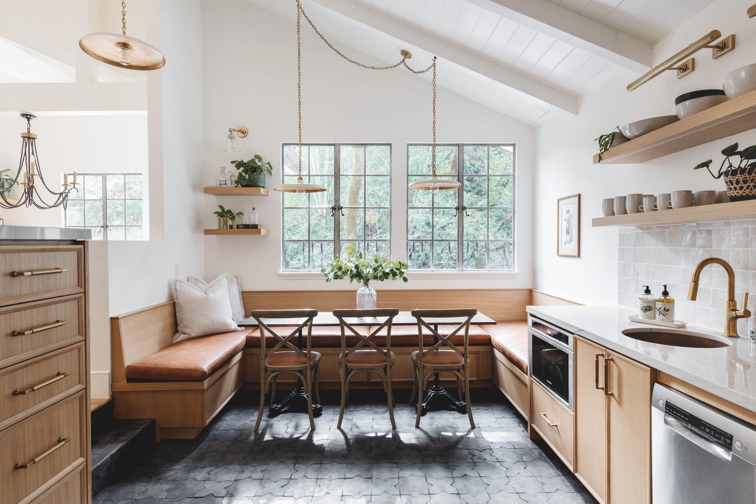
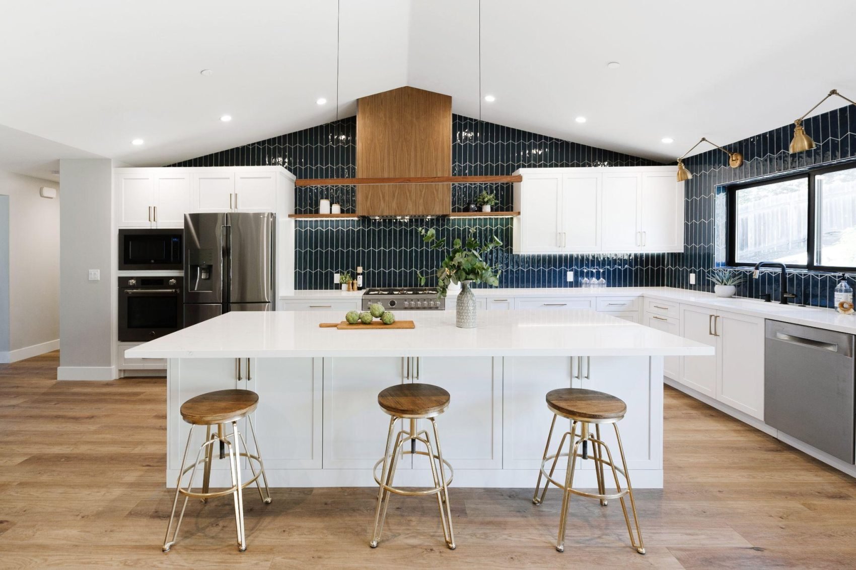
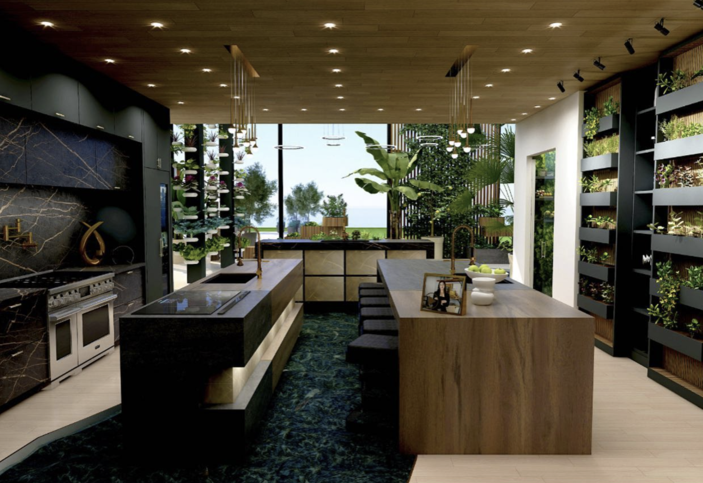
Creating Bespoke Kitchen Spaces for Luxury Homes
At Honeycomb Home Design, we understand that the kitchen is the heart of the home. As an award-winning full-service interior design firm based on the Central Coast of California, we specialize in crafting bespoke kitchen spaces that combine functionality with unparalleled elegance.
The Benefits of Nationwide Virtual Design Services
At Honeycomb Home Design, we are proud to offer nationwide virtual design services that bring our award-winning expertise to clients across the country. Located on the Central Coast of California, our full-service interior design firm specializes in creating timeless interiors filled with rich tones and textures. Here’s why virtual design services are an excellent choice for your next project.
Top Luxury Interior Design Trends for 2024
At Honeycomb Home Design, we pride ourselves on staying ahead of the curve when it comes to the latest in luxury interior design. Our commitment to creating timeless, rich-toned, and textured interiors has earned us numerous accolades, and we are excited to share the top luxury interior design trends for 2024.
How to Choose a High-End Interior Designer for Your Home
Choosing the right interior designer is crucial when you're investing in a high-end home project. At Honeycomb Home Design, we understand that your home is one of your most valued assets. Our award-winning, full-service interior design firm, located on the Central Coast of California, specializes in creating timeless interiors filled with rich tones and textures.
How to Pick the Perfect Paint Color
Paint is the least expensive way to transform a room yet it can be one of the most challenging things to select.
The Best White Paint Colors by Benjamin Moore
If I had a nickel for every time we are asked, “What is the best white paint color?”
The Best White Paint Colors by Sherwin Williams
White paint colors can be the most challenging to select!
Before and After Transformation of a Single-Level Home
Whole house remodels are our favorite! Why? Because they are complicated, challenging, messy, but the end result is always so worth it!
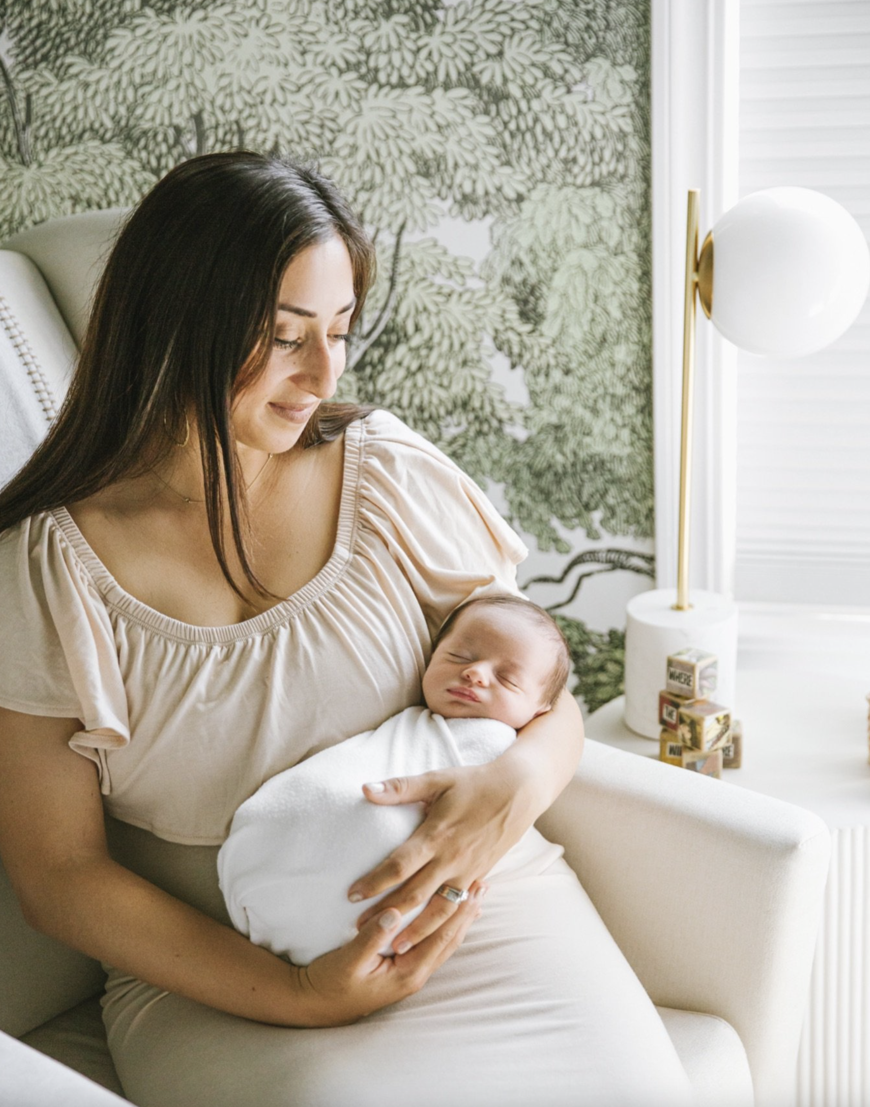
Top Luxury Baby Product Finds for Nursery
Designing our nursery and actually using it for our two boys has been so much fun!
Honeycomb Home Design's Feature in Forbes: Seasonal Living Virtual Luxury Designer Showhouse
Well - I can check this off my bucket list!Being featured in Forbes is such an unimaginable feeling!

Honeycomb Home Design Founder Wins Prestigious NKBA Award
For the past eight years, the National Kitchen and Bath Association awards 30 Designers from around the country, all 30 years and under, this prestigious award.